Hi! Here’s my reflection on working on the eCommerce site for Project 3. I honestly think this was my least favorite project to work on. It took the longest and was more complicated with all the buttons and parts to add to the site. It took forever for me to figure out how to do the CSS coding for it and it just made it harder for me to do it. I also had a hard time adding newsletters and those things for when or if someone signup up, I used mail poet for a plugin for if someones were on the site and abandoned their cart after 30 minutes it’d send a newsletter. It’s not really visible to you now but could be if you were actually shopping. I also added the google fonts plugin which allowed me to change the font of the site which made it a lot easier on me than trying to figure out the HTML and CSS importing, Which I could not figure out so I resorted to the plugin. The CSS was fairly easy once I figured out how to find it and then I mostly changed the background, the color of headings/titles/other things, and just some other styling. Nothing major since most work is done with the WordPress portion. The project for this part wasn’t super difficult but just really roundabout and honestly took much longer to do everything versus just handwritten coding. Most of the widgets if not all should either link or be interactive. The Spotify even links to a. playlist! It was kinda fun going over the types of widgets you can add and I can admit it got a little tacky towards the end so I had to review them and get rid of some, but the YouTube song was definitely a must. It made it seem fun and encouraging. Overall, I am fairly proud of how it came out since it has the basic parts of the theme like in project 2’s template, but it came out looking really different and separate and you can see I put work into it. The white tank top, journey shirt, and sports bra all have been fleshed out, but with different aspects added to it. I am especially proud of the colors and fonts used. It makes it look like an actual home business. I also added a logo at the top like other websites and the logo I used I made through GoDaddy studio. I even added pictures to the categories to make it seem more professional. And for the customer reviews/ testimonies, I made them all and thought it’d be easier and cooler to do it as on posts on the homepage where you could get updates like if you were letting them know when fall or winter season drop for clothing was coming and get a timestamp. It also is great for customers to comment on what they thought and get responses from the admin. It also can be used for “need help” which I included in the posts! So I am super happy how it turned out and I hope you are too! I hope to learn more ways to include sizes or certain buttons like in etsy where you can add elements to personalize gifts or clothing. I think it reduces complexity for the layout of developing a website but at the same time doesn’t. In. coding, I think it is relatively easier to make color, fonts, and more look the way you want. With WordPress, its more static and creative freedom isn’t really its thing. I know its for beginners and those who don’t know coding, but it just felt wrong. Leave a comment, let’s see if admin responds!
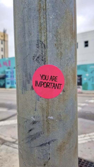
Need Help?
We can help you as quick as we can if you comment below to let us know your problem or simply need styling advice!

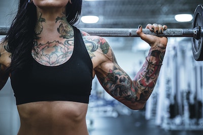
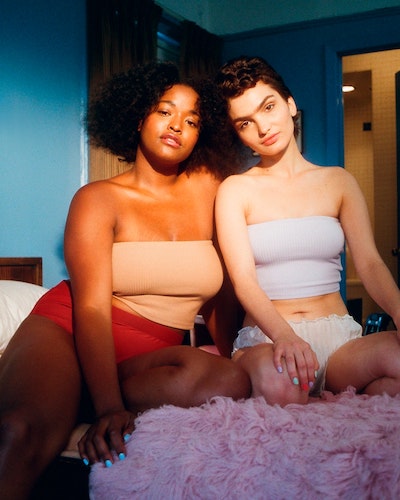
First Our Customer Testimonies
Please let us know what you think! BE HONEST, we can handle it! We want our customers to be more than happy so let us know in the comments below!